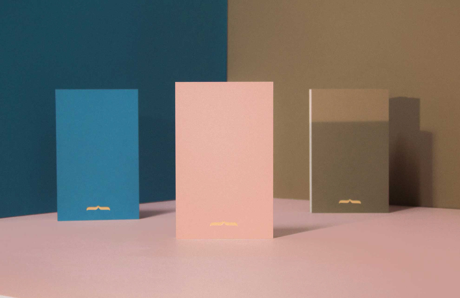
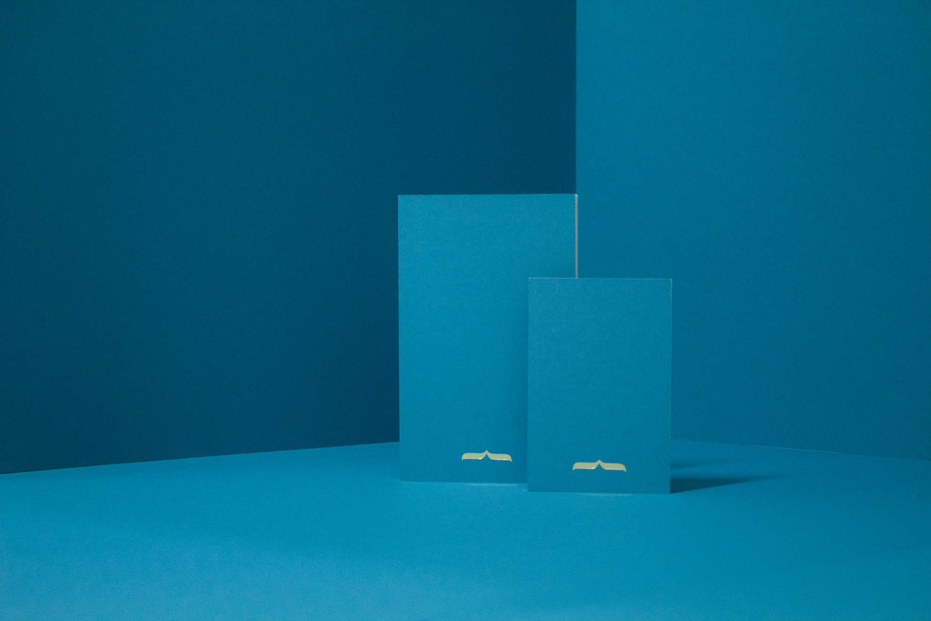
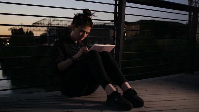
LetterPi is not just a simple notepad. It is passion, dedication and quality combined with ink-marked hands, typographic art and innovation. It is a traditional as well as contemporary, a luxury as well as a functional product.
I followed and coordinate the creative direction of all the promotional assets like photo and video with the videomaker Giulia Marcialis and I realized all the brand elements of Michele Letterpress.
I was involved in the design of LetterPi testing the functionality of the materials with the printer thanks to the many illustrator that they tried the notepad.
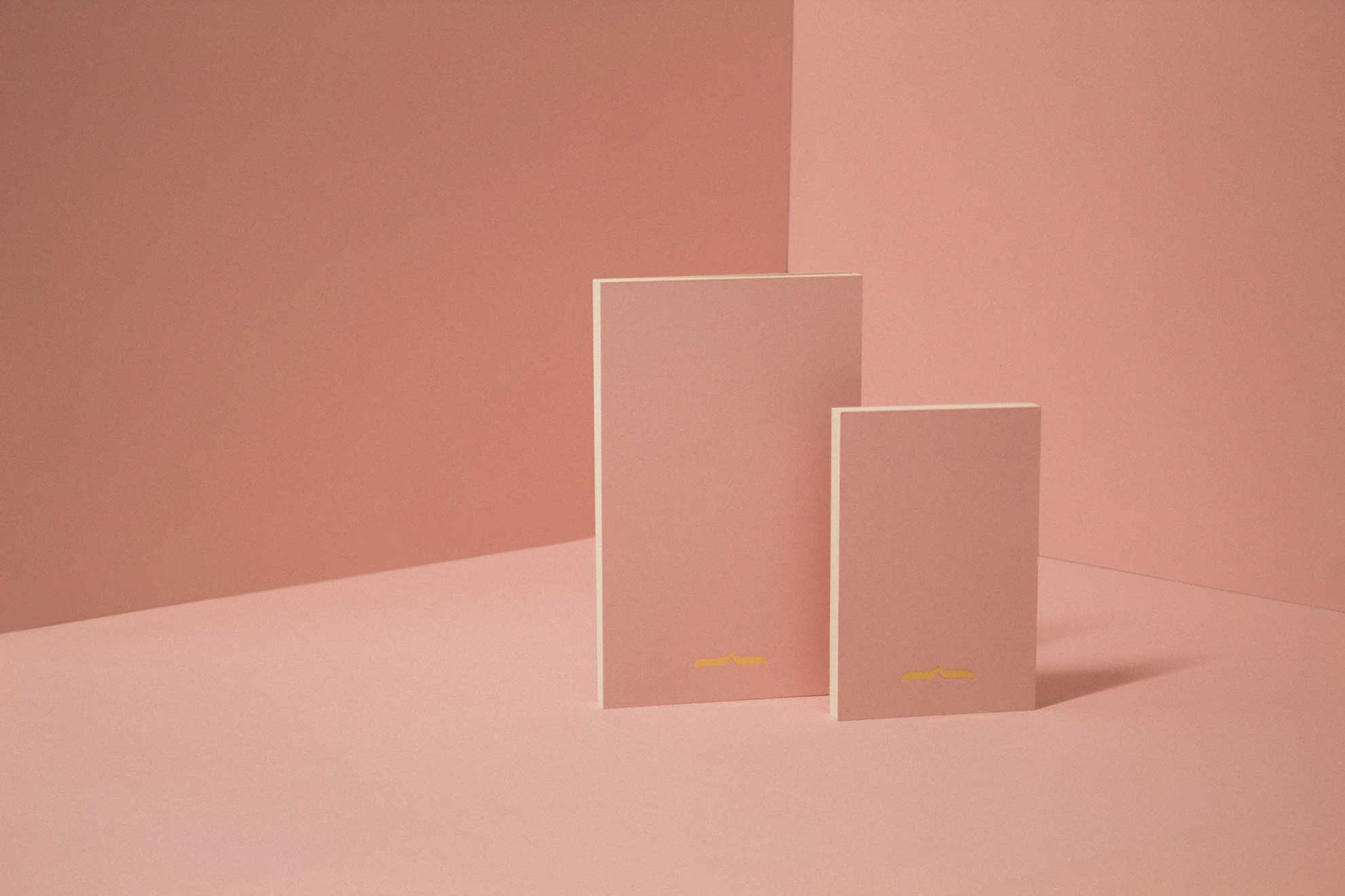
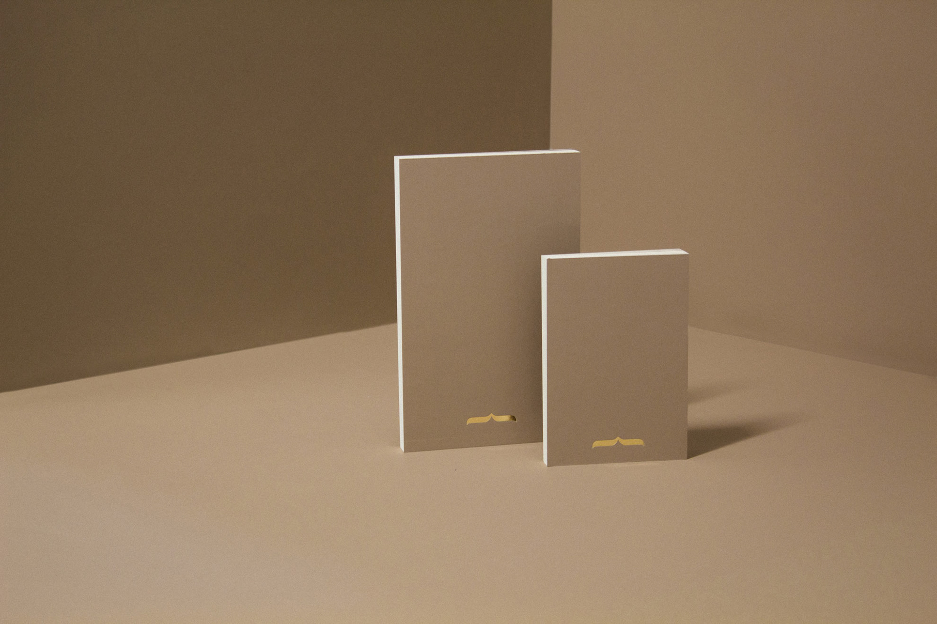
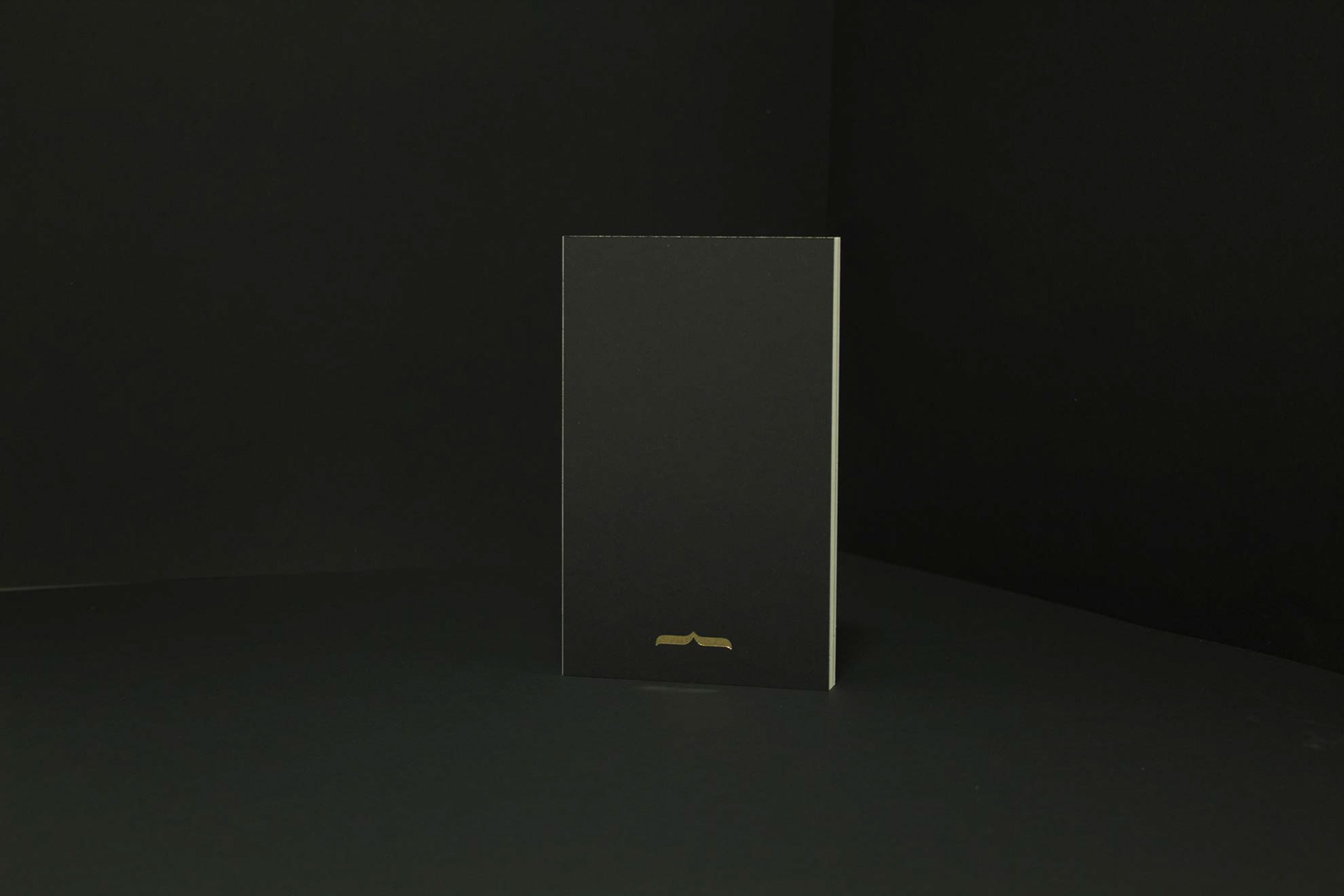
LetterPi: what is it?
What every designer, illustrator and writer looks for in a notepad is comfort and the feeling of being supported without limiting their abilities. Why settle for something ordinary? Why not choose something elegant, niche, cool or simply beautiful?
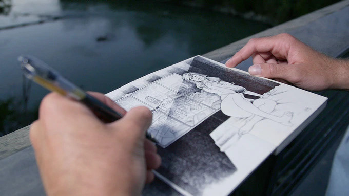
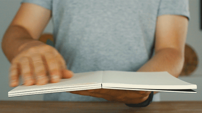
Anything is a table
Thanks to its really-flat opening, that is a completely-flat 180°- opening combined with an extra-stiff cover, this notepad can be used everywhere. It will feel like writing or drawing on a desk wherever you are: at the park, on the bed, while traveling you will always have the chance to do your best, in the best way possible.
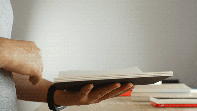
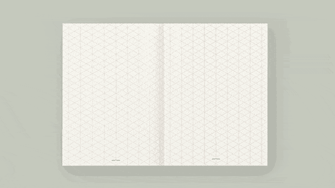
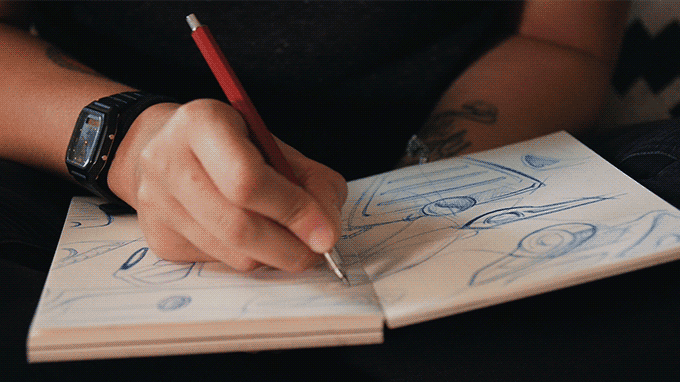
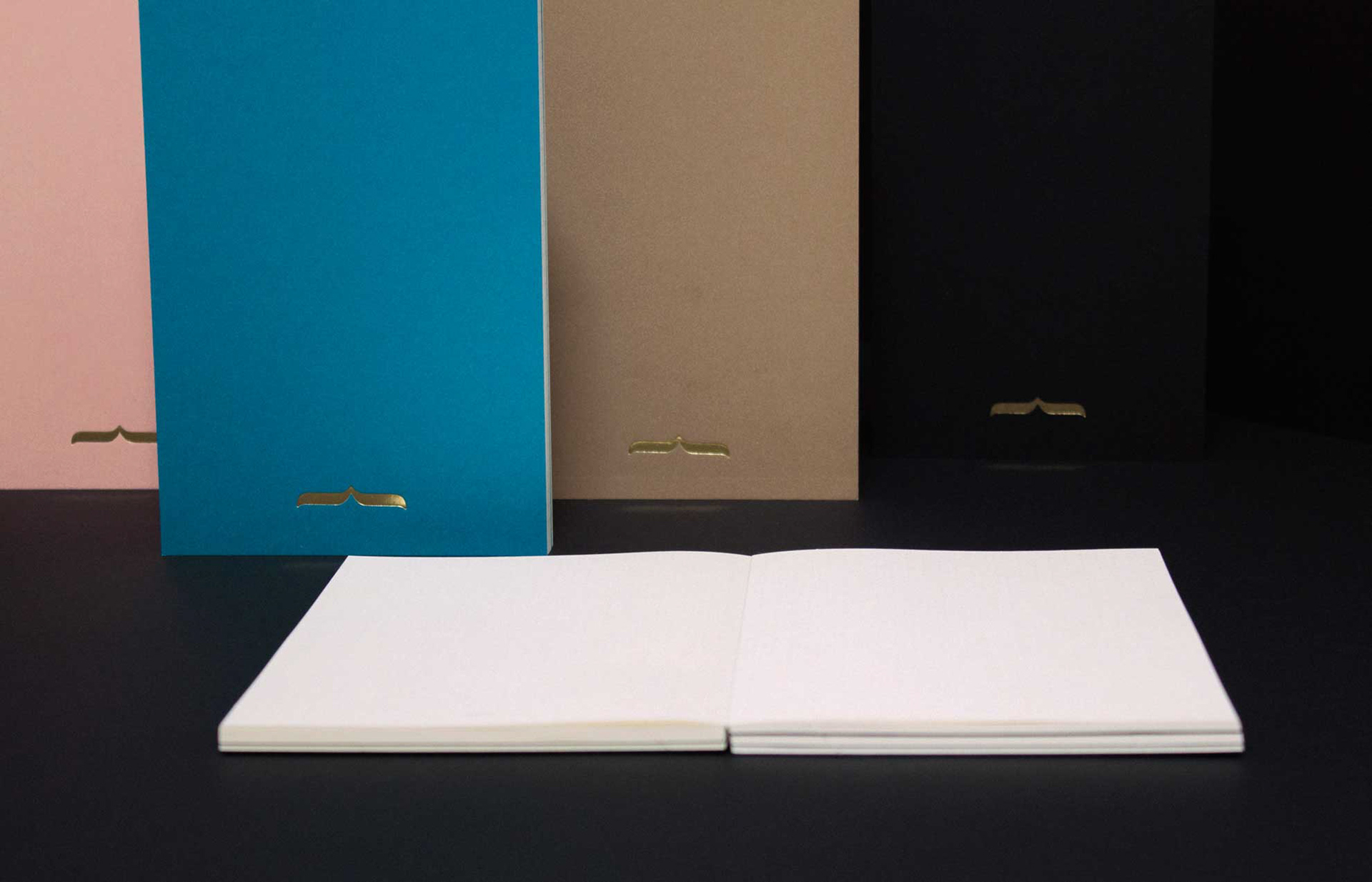
Interior Value & Elegance
One of the most valuable aspects of this notepad is its interior. That is, the interior that you will create yourself. Because all the things which will be drawn or written inside LetterPi will acquire an added value, thanks to the elegance, attention to detail and robust design characterizing it. Its design conveys confidence and trust thanks to its clean cut, the tactile feeling you have when holding it in your hands and the fact that every sheet of paper stays perfectly stiff even when you leaf through it. Moreover, very high-quality paper is used. It is thick, resistant and ready to embrace all your sketches.